Redefining the product campaign process and establishing an evergreen art direction for more cohesive global marketing for GoPro
Project Summary
When I first joined GoPro in the summer of 2018, I was helping execute the HERO7 Spring travel campaign and developing ideas for the launch of HERO8. At that time, and until the release of HERO11, there was no narrative, visual or strategic consistency from one campaign to the next. What that ultimately led us to was fragmented creative executions, inconsistent messaging, and missed opportunities to clearly articulate GoPro’s unique value.
To address this, myself, my senior CD and the (then) ACD of Brand implemented a strategic shift that established more consistent, year-round marketing and product narratives. We introduced a unified creative process and developed comprehensive brand art direction guidelines to ensure consistency across all product launches. This not only helped streamline creative workflows but also made it easier for our audience to understand the value of our flagship cameras in a crowded market.
The HERO11 Black campaign marked the beginning of a new approach to integrated, annual campaigns, underscoring GoPro’s ability to capture life’s best moments with the most powerful camera ecosystem on the market.
My Role
Associate Creative Director, Advertising
Services
Art Direction, Creative Direction, Creative Strategy, Design
Timeline
2022–2024
In Collaboration With
Brand, Media & Photography Teams, Studio Leadership, Company Leadership, Performance Marketing
Prioritizing the Reason to Care
This likely feels obvious to marketers, but we wanted to focus our campaign, particularly the awareness messaging for HERO11 Black (and future campaigns), on communicating an emotionally-resonate product value to our target audiences.
This wasn’t the typical approach we took at GoPro for new products, oftentimes building campaigns entirely focused on the new features of a camera vs why those new cameras or features or even this company should matter enough to spend your money.
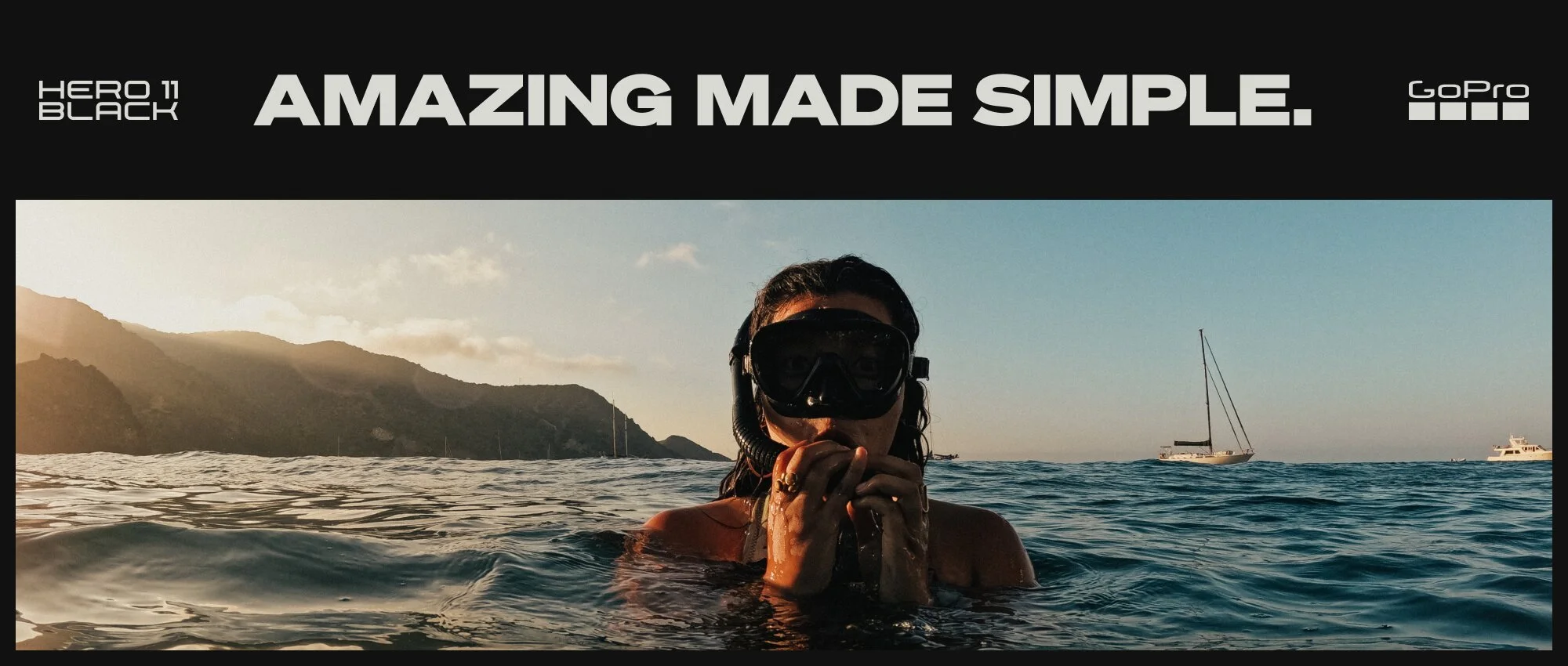
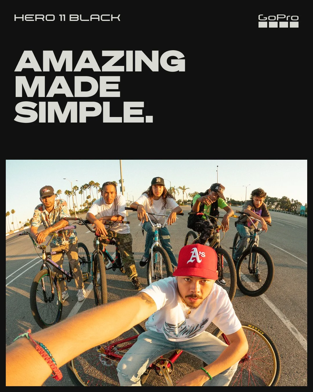
Amazing Made Simple, with GoPro
there to capture your best moments with ease
GoPro believes in the value of living your life to the fullest, experiencing all the world has to offer, and doing so as present-in-the-moment as possible. We talk about immersive capture not only because of the unique ability to capture from your perspective, but because we believe our job is to provide the tools to allow you to focus on the thing you’re doing, while you’re doing it.
Amazing Made Simple was our way to communicate that while HERO11 Black was offering our most powerful set of features to-date, it’s ultimate benefit to customers is the the simplicity it offers. You focus on experiencing life, we focus on making sure those captured moments last you a lifetime.
*To be frank, the ease or simplicity of using a GoPro camera is highly relative to a user’s familiarity with camera equipment, but with features like built-in mounting fingers, voice control and HyperSmooth, the camera arguably provides an immensely powerful set of features with the express purpose of making the capture process as user-friendly and high quality as possible.
Establishing an Evergreen Art Direction to Support the Product (and Brand) Payoff
With the HERO11 Black campaign we were trying to reset how internal creative teams approached developing campaign materials not just within a single campaign, but from one campaign to the next, and one camera to the next.
Rather than generating bi-annual campaigns with new messaging and ephemeral art directions, we sought to develop an art direction that could last us for years. A visual narrative that spoke to our purpose and our payoff as a company. Each camera and each product launch might bring with it some unique flavors to the mix, but the foundation would remain the same.
When Life Meets Tech
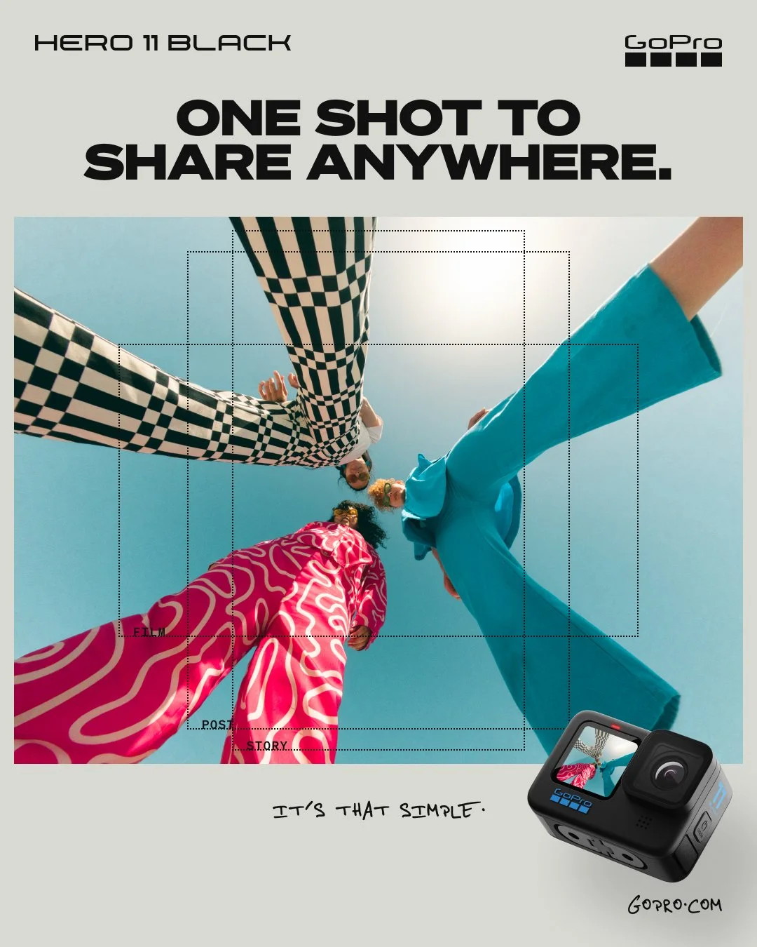
GoPro really thrives in the space between life[style] and technology, and we developed an art direction that would look to reflect those two halves of our whole.
Nothing speaks more powerfully to what a camera is capable of than the imagery it produces, so product output was always at the forefront of how we wanted to express our brand, product and feature value. How we expressed what “defined” GoPro output, either by the activities we showed, how imagery was edited, or what type of images we showed, was frequently a challenging and contentious issue for us. Nevertheless, image was king.
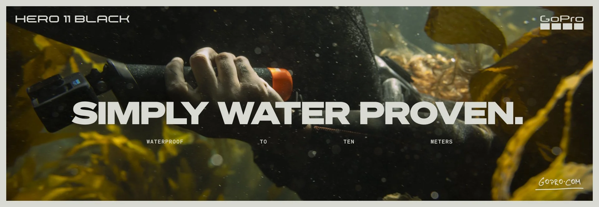
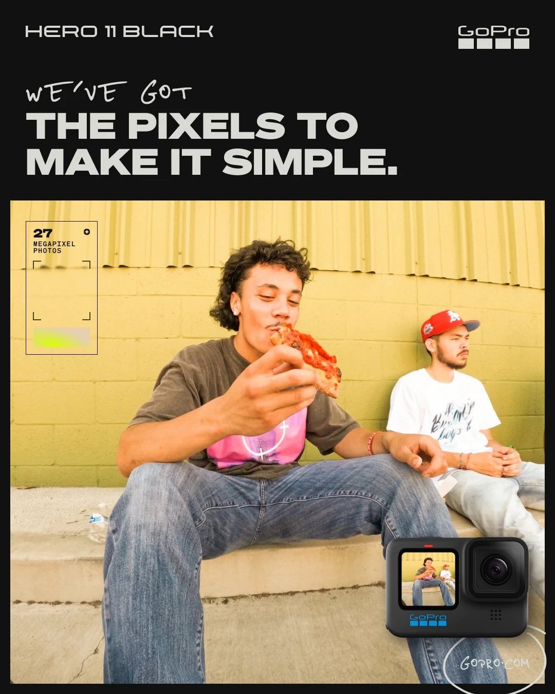
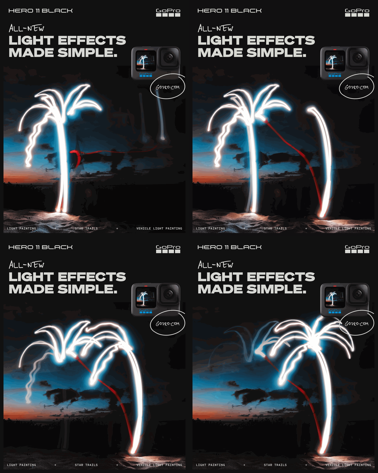
Elements like hand drawn type and energetic graphic marks with technical icons and descriptive text worked to add on to our images and messaging, visualizing these opposite but complimentary components (life + tech) of our brand.
Flushing out a Full Funnel Paid Advertising Campaign
We looked to support our campaign message, Amazing Made Simple, all the way down our ad funnel. Each feature ideally spoke to a more specific example of why the HERO11 Black was worth being called amazing, and how these features simplified what you could accomplish with this one tool.
Art Direction & H11 Campaign Creative Collaborators
Andy Shiels, Creative Director, Brand | Michael Manny, Senior Creative Director | Jensen Granger, Creative Director, Photography
Ad Team and Creative Collaborators
Ellie Roseveare, Project Manager | Melanie Arzouman, Producer | Zach DeVincent, Senior Copy Writer | Gerry Pirritano, Art Director | Josh Sanders, Graphic Designer | Ryan Truettner, Senior Video Editor | Skylar Smith, GFX | Brian Town, Creative Director, Media
