Crafting a brand identity to promote LA-based pop up Abbiocco Italian Foods
Project Summary
Abbiocco Italian Foods is a (you guessed it) Italian American foods and natural wine pop up originated in the Bay Area, now located in LA (and currently on hiatus). The idea for Abbiocco was born in one of those classic Noe Valley Victorian apartments my husband and I lived in. Like any good chef (him) + designer (me) duo, we had big dreams of owning our own restaurant one day, and the pandemic seemed like a great time to bring our dreams to life. (I say that somewhat unironically.)
He wanted to take the literal blood, sweat and tears he had poured into his two decade plus career and create a space that paid homage to his Italian American upbringing while taking advantage of the incredible product we have in California. I saw this as the perfect opportunity to leverage my passion for design and storytelling to help bring his vision to life.
The best selling point for aspiring restauranteurs is proof that you know what you’re doing. Abbiocco needed to feed people as quickly as possible, and pop ups are the best way to start making something, quickly. And in order to get people signed up for our pop ups we needed something “tangible” for people to connect with. For us that meant developing the story, identity and voice of our restaurant to communicate who we were, what we were doing, and give people a reason to participate. Although not currently running, the full scope of this project included branding, posters, social media content, a website and a business proposal to attract potential investors. I stretched my business and creative limits for this project, and I hope that one day we’ll be inviting people into our brick and mortar restaurant.
My Role
Owner, Designer, Social Media Manager, Event Manager, Host, Server, Cook 😅
Services
Art Direction, Brand Identity, Brand Strategy, Graphic Design, Illustration, Web Design
Timeline
2020–2023

but quick…
Abbiocco refers to the sleepy feeling you get after a big meal. It's our invitation to be present in the moment, to indulge in a good meal, good wine & good company, and to shrug off your responsibilities for a brief time before returning to the real world.
It's an idea that we love and often brings a smile to people's face while expressing our intention to create an experience that delights and comforts.

Primary Logo


Mascot
Social Logo
A Developing Brand Identity
As the business itself has continued to evolve, so too has the branding. What Abbiocco was—the concept, the menu, the restaurant—all went through a number of iterations as we developed the business proposal, considered investment implications and reacted to the changing economy.
I was heavily inspired by midcentury design at the start, which correlated with the boom in popularity of modern day Italian American restaurants in the States, but evolved the brand identity into more of an amalgamation of mid century, art nouveau and some visual reference to old world European and new age digital design.
The “final” logo marks still reflect the playfulness and whimsy we wanted to inject into our brand (inspired by our name), but became more refined over time.
The color palette, image and illustration styles went through similar changes, reflecting in real time the evolution of Abbiocco.

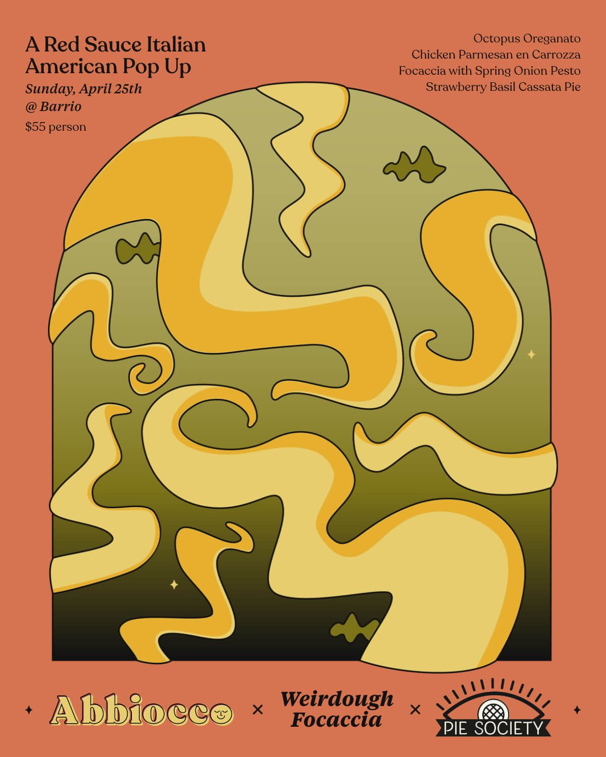
Getting Playful with Design
The majority of our digital interactions with our audience were happening on Instagram. It became vital to develop an eye-catching visual style to catch people’s attention, start defining who we were as a brand, and excite people before they had an opportunity to experience Abbiocco in person.
We didn’t have any photography of our food to use before our first event so I decided to make an illustration to give us something to play with. The spaghetti squiggle kicked off a series of custom illustrations that gave us a unique look, and spoke to the playfulness of the brand. Like everything else, the pop up poster visual shifted over time to lean more heavily on photography and informational design, but these early visuals helped clarify how we showed up online and in the world.


A To-The-Point Website
Like all things with Abbiocco, the site has evolved to best suit the current needs and goals of the business. Initially we used our site to provide more information about ourselves, the pop ups, and our goals for our restaurant including a link to our business proposal for potential investors. As we slowed down the pop ups and hit pause on our dreams of opening our own place, the purpose of the site shifted towards providing a quick taste of who we are and directing people towards our Instagram.
